Design better components
Tips for enhancing your component design and improving collaboration with engineers
This article provides actionable advice for designers working on or contributing to a design system. It aims to help them create better components and foster stronger relationships with their engineering colleagues.
Do your research
In the world of design, it's all about understanding the lay of the land. If you're not clued into what you're designing for, how can you tell when you've hit the mark? Even trickier, without a clear goal, it's tough to know when you're really finished 🤯.
Starting with clear goals for your component is essential. It's like having a guiding star for your journey, and it keeps you on track.
Once you've got your goals sorted, it's time to hit the web and check out how other design systems have handled similar challenges. Don't fall into the trap of thinking your issues are so unique that no one's ever tackled them before. Chances are, somebody's been there, done that. As a systems designer, your job is to add your unique design flair while keeping things user-friendly and accessible.
To kickstart your research, here are a few places on the internet where I like to poke around:
And of course for my accessibility research:
Iterate in Figma
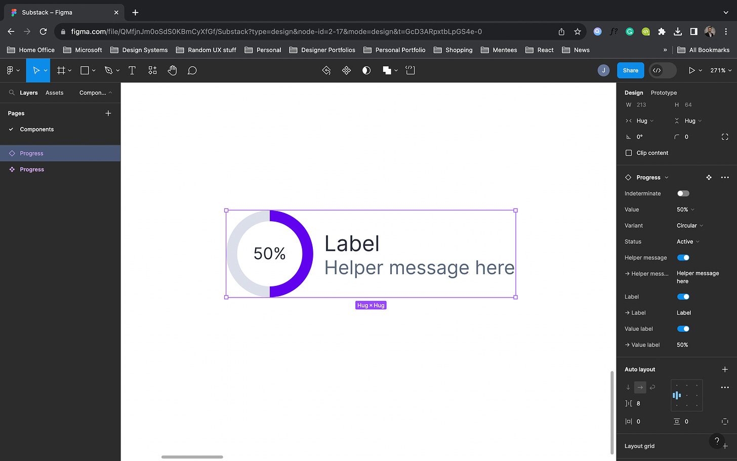
Starting the design journey with Figma mock-ups and then making the shift to code brings some great perks. Let's look at a recent project as an example - I was working on the Progress component. Figma was a total lifesaver in helping me envision how this component should work. And, with Figma's auto layout features, I could build a design that feels just like CSS flexbox, making it a smooth transition from design to the technical side of things.
Iterate in code
I understand that this part might become a bit technical, but bear with me. Proficiency in any field comes in various stages, and I certainly don't consider myself a coding expert. However, as I delve deeper into design systems, I'm committed to constantly enhancing my grasp of modern programming languages and frameworks. While crafting this component, I drew significant inspiration and knowledge from Gusto's Workbench Design System and Adobe's Spectrum Design System, particularly for their progress components.
Getting a grip on your partner's language, especially when it's the engineer's jargon, is like arming yourself with a communication superpower. It's not just about understanding each other's goals and overcoming challenges; it's also about diving into accessibility and design dilemmas with confidence. Let's take an example from my recent work on the Progress component, where I dived deep into the following:
progressbar role: The
progressbarrole defines an element that displays the progress status for tasks that take a long time.aria-valuemax: The
aria-valuemaxattribute defines the maximum allowed value for a range widget.aria-valuemin: The
aria-valueminattribute defines the minimum allowed value for a range widget.aria-valuenow: The
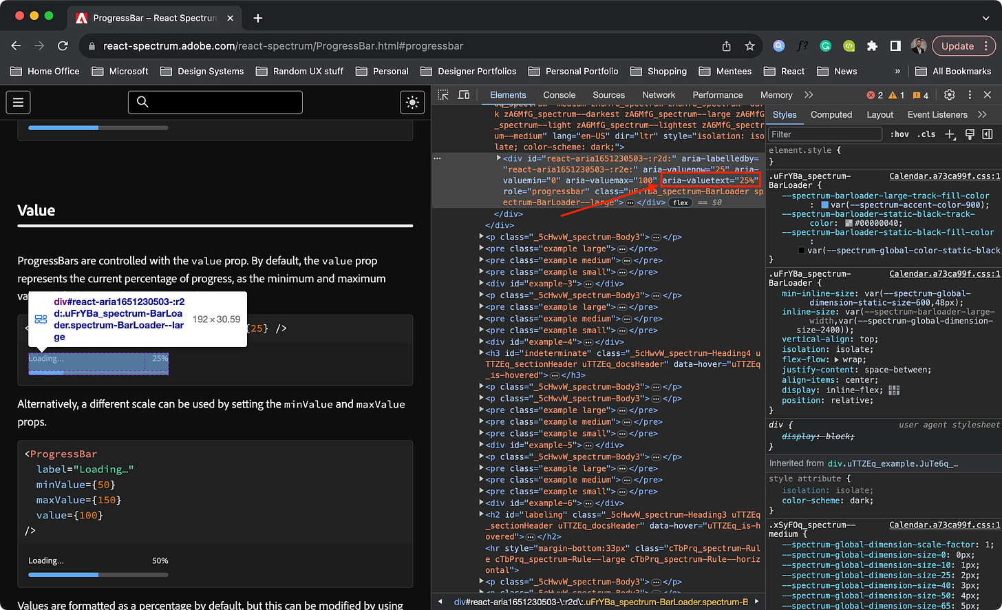
aria-valuenowattribute defines the current value for arangewidget.aria-valuetext: The
aria-valuetextattribute defines the human-readable text alternative ofaria-valuenowfor a range widget.
By digging into research and mastering the intricacies of progress components, I managed to whip up a component that's almost ready for prime time, all set to test my ideas.
The video below is a recording of the Progress prototype I built in TypeScript React.
I borrowed an implementation detail from Spectrum as well. They utilize the aria-valuetext attribute, which led me to employ interpolation to express the Progress value as a percentage by dividing it by the Progress max and appending the '%' symbol.
 <div
      className="progress-bar"
      role="progressbar"
      aria-valuenow={value}
      aria-valuemin={min}
      aria-valuemax={max}
      aria-valuetext={`${(value / max) * 100}%`}
>...</div>Talk with engineers
I understand they might come across as intimidating, but trust me, engineers are not as scary as they may seem. In fact, the more you chat with them, the more you'll uncover some seriously cool stuff. Building those bridges with engineers isn't just about fostering better user experiences; it's also about supercharging your own skill set.
Let me share my journey – during my first crack at a design system, I got my first glimpse of JSON and React. My time at Microsoft was all about mastering the art of writing React and TypeScript in harmony. Over at Gusto, I delved deeper into the world of composition. And recently, I’ve ventured into the realms of Kotlin and Swift. The key takeaway here? I always keep an open mind and eagerly express my desire to learn from my engineering comrades, wherever I find myself.
“Anyone who stops learning is old, whether at twenty or eighty. Anyone who keeps learning stays young. The greatest thing in life is to keep your mind young.”
— Henry Ford
Test your ideas (often)
No need for a fully cooked idea to start testing the waters. Honestly, I'm all for taking small steps. Working in an agile way with your engineering buddy helps you catch those hiccups before they become full-blown problems. It's also a goldmine for getting feedback and ideas that might not have crossed your mind.
Conclusion
Keeping the lines of communication wide open did wonders for me when collaborating with my engineering colleagues. I'd recommend you tackle your interactions with an open mind and a humble attitude too. We're all in this together, constantly learning from one another and paving the way for our personal and professional growth.
Thanks a ton for giving this article a read! If you found it helpful, do consider subscribing. And if you've got any thoughts or feedback, don't hesitate to drop me a message on Instagram.


