Design systems should do less
Why design systems should cover less scope, not more
I’ve been part of several design systems teams, working on some pretty cool projects like Fluent at Microsoft, Workbench at Gusto, and Pantry at Albertsons. One thing that consistently comes up is scope creep. Design systems often get treated like a catch-all — after all, they are just a bunch of components, right?
I recently wrote about governance models in design systems. But, this article dives deeper, explores the pitfalls of overloading design systems with too many components, and presents an alternative approach to sustainably managing component responsibilities.
The scapegoat
Organizations often assume that a design system can solve every problem and control every aspect of their design. However, this mindset typically leads to significant technical and design debt, as well as bloat.
When everything is componentized, the design system team can become bogged down with fixing bugs and updating components, rather than focusing on innovation and coaching.
Quantifying the opportunity cost can be challenging, but it might include skipping:
Accessibility testing: Ensures products are usable by individuals with disabilities and helps avoid legal fines.
Theming support (design tokens): Enhances user experience for those who prefer modes like dark mode and ensures consistency across components. It also accelerates the development of new components.
Performance improvements: Boosts overall system efficiency and user experience.
Training on design system concepts: Equips designers and engineers with the knowledge to use and extend components effectively. Without proper training, poor implementations can lead to increased technical debt and frustration.

Before joining Gusto I thought that the best way to build components was to be highly opinionated, meaning that the components should have a prop for everything. In theory, this approach might sound valid–a design system should have strong opinions and guardrails in place…right?
Let’s take a look at what I would consider a highly opinionated component from the Polaris Design System:
import {Link, AccountConnection} from '@shopify/polaris';
import {useState, useCallback} from 'react';

function AccountConnectionExample() {
  const [connected, setConnected] = useState(false);
  const accountName = connected ? 'Jane Appleseed' : '';
  const handleAction = useCallback(() => {
    setConnected((connected) => !connected);
  }, []);
  const buttonText = connected ? 'Disconnect' : 'Connect';
  const details = connected ? 'Account connected' : 'No account connected';
  const terms = connected ? null : (
    <p>
      By clicking <strong>Connect</strong>, you agree to accept Sample App's{' '}
      <Link url="Example App">terms and conditions</Link>. You'll pay a
      commission rate of 15% on sales made through Sample App.
    </p>
  );
  return (
    <AccountConnection
      accountName={accountName}
      connected={connected}
      title="Example App"
      action={{
        content: buttonText,
        onAction: handleAction,
      }}
      details={details}
      termsOfService={terms}
    />
  );
}
The example above renders a component called AccountConnection, a card with built-in features like a title, subtitle, body copy, and button label. And depending on the connected state will render one of two things:
For some teams, this pattern might work, but what I tend to find is that building components like this has diminishing returns. More often than not a feature team will come to the design system (DS) team and ask for something to be changed on the component. The DS team will then need to add or modify a prop and then ship that new component feature in the next release. If strong guidelines are not in place, these components can quickly get bloated with frivolous props.
What’s the alternative?
In Workbench, we took a less opinionated stance. We built the shell of the components, defined styles where necessary, and left the APIs pretty open for consumers to configure as they saw fit. We relied heavily on our documentation for consuming teams to digest and follow. This approach saved us from painting ourselves into a corner by providing too many props.
Let’s take a look at the Card in Workbench:
<Box maxWidth={400}>
    <Card>
      <CardHeader
        action={
          <IconButton title="Dismiss" onClick={() => console.log('click')}>
            <Close />
          </IconButton>
        }
      >
        <Heading level={3}>Get started with payroll</Heading>
      </CardHeader>
      <CardBody>
        <p>
          Lorem ipsum dolor sit amet consectetur adipisicing elit. Architecto aliquam sit voluptatum
          sapiente unde, sequi, tempore minus debitis quam porro dicta.
        </p>
      </CardBody><CardFooter>
        <Link href="https://gusto.com" after={<ChevronRight />}>
          Add option
        </Link>
      </CardFooter>
    </Card>
  </Box>
The example above renders the Card component. We provided multiple subcomponents like CardHeader, CardBody, and CardFooter. We were opinionated about where an IconButton would render in the Card so we created a slot in the CardHeader called action. This prop was responsible for the placement of a node but did not “care” what node was passed to it.
Polaris has a Card component that is pretty unopinionated too, similar to the one I showed from Workbench. I would have suggested they stop there and not create the AccountConnection component. Rather, I would have documented that pattern and enabled a feature team to localize the component by extending Card.
Many DS teams struggle to find the right balance between what should and shouldn’t be included in the design system. I believe more teams should build abstraction libraries on top of design systems, creating patterns that use system components and primitives like Box or Stack with design tokens. In my opinion, a design system shouldn’t cover 100% of your UI screens. A reasonable goal is 80/20, where the design system’s components get you 80% of the way, and the remaining 20% comes from localized components abstracted from design system primitives.
Localized doesn’t have to mean components used by only one team. If multiple teams share a common component configuration, they can build and maintain a shared component library.
Patterns
Another effective way to decentralize design system responsibilities is by adding a patterns section to your documentation site. Polaris does this well by providing detailed examples and copy-and-paste code. They get it right by showcasing compositions without turning them into components.
The cost of over-engineering
While it might initially seem beneficial for the DS team to manage every aspect of the UI, there comes a critical point where this approach backfires. When the DS team maintains all the components and handles every request from product teams, they disempower those teams from innovating and self-servicing. Eventually, the DS team becomes a bottleneck, leading to frustration among consumers and stakeholders and significant opportunity costs.
Let’s consider two approaches to handling a feature component request from a product team.
Scenario 1: The “service” approach
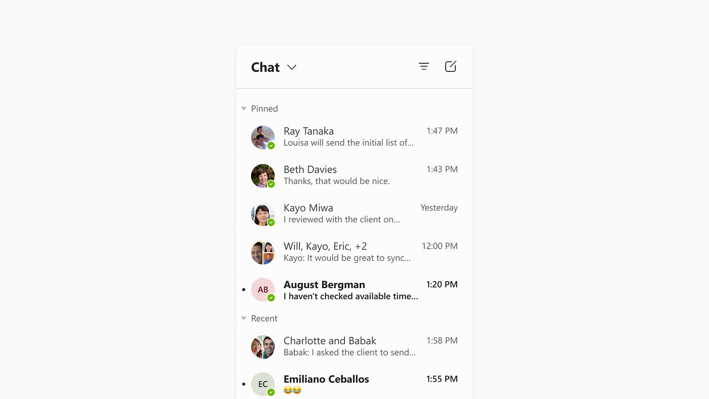
A product team is building a chat feature in their UI. They determine they need a horizontally-aligned card with an avatar, title, subtitle, and indicator. They approach the DS team to request a ChatCard component. As a service team, the DS team builds this ChatCard component, adding props to accommodate the feature team's needs.
import {ChatCard} from "@company/design-system";

export const Example = () => {
return (
 <ChatCard avatar={currentAvatar} title={currentTitle} subtitle={currentSubtitle} onClick={handleOnClick} unread={currentStatus}/>
 )
}
Later, another team wants to use this component but with an additional icon. The DS team, acting as a service team, agrees and adds a prop for the icon. This happens a few more times, and soon, the API that started with a few props now has 20, leading to bloated and conflicting APIs.
To avoid this, I use a simple litmus test with two questions that must both be true to add a component to the design system:
Is this component used in three or more places across products?
Is this component generic enough to be useful in future cases?
In this scenario, the ChatCard would fail the test.
Scenario 2: The “decentralized” approach
Instead of creating a specific ChatCard component, the product team can create a localized version by composing existing design system components.
import {Card, Stack, Text, Avatar} from "@company/design-system";

interface LocalChatCardProps {...}

export const LocalChatCard: React.FC<LocalChatCardProps> = ({...}) => {
return (
 <Card orientation="horizontal" onClick={handleOnClick}>
  <Avatar src={src} />
   <Stack gap={100} orintation="vertical">
    <Text is="h2">{title}</Text>
    <Text is="span">{subtitle}</Text>
   </Stack>
  {unread && <span style={indicatorStyle} />}
 </Card>
 )
}
For those unfamiliar with coding, what I’m doing here is simply wrapping the existing Card component from the design system.
By leveraging existing design system components to create localized solutions, product teams retain the flexibility to meet their unique needs without overloading the design system with niche components.
This approach not only empowers teams to innovate and iterate more quickly but also keeps the design system lean, focused, and easier to maintain. Ultimately, this balance fosters a healthier collaboration between design system teams and product teams, where the design system serves as a robust foundation rather than a restrictive bottleneck.
What should the system own?
We’ve explored what a design system should avoid managing, but what should it actually own?
In an ideal Engineering, Design, and Product (EDP) organization, three key collaborative components are essential:
Design System Team: Manages core components, design tokens, and the underlying infrastructure.
Framework Team: Oversees the implementation of design system components across teams and the overall application structure.
Feature Teams: Develop and manage common patterns, and localize components to meet specific needs.
The role of a framework team is gaining traction, as evidenced by job postings with “framework” in the title. This team focuses on managing the implementation of design system components and assets, as well as the application’s overall structure. By having a dedicated framework team, the DS can concentrate on creating new components, developing guidance, and coaching teams on effective component usage.
More teams should feel empowered to create off-shoots of the main design system. For example, at Microsoft, the Teams Component Library extended the Fluent Design System to include product-specific components. This library, maintained separately from the broader design system, allowed over 100 designers to leverage shared resources while meeting their unique needs. This approach exemplifies how product teams can remain empowered to address their specific requirements while still benefiting from the overarching design system.
Do you like what you are reading? Refer a friend!
The role of governance and guidance
To prevent scope creep, it’s crucial to establish clear principles and processes from the start of a design system. Key questions to address include:
What is the purpose of the design system?
What problems are we aiming to solve?
What qualifies as a component?
How will we regulate design assets?
Defining these answers early on provides a clear direction, helping to manage and streamline component requests effectively and maintain focus.
Tying it all together
Design systems don’t have a one-size-fits-all solution, but a conservative approach is often the most effective, especially in the beginning. Here are key strategies to consider:
Start simple: Begin with the most fundamental HTML components and build upon them as needs evolve. This helps establish a solid foundation without overcomplicating the initial design.
Flexible APIs: Provide adaptable component APIs. Favor using children for customization over top-level props to avoid an overly complex API surface and to accommodate future changes more easily.
Scope design tokens wisely: Limit the initial scope of design tokens. Expanding their scope can be tempting, but it’s easier to add new tokens than to deprecate or remove existing ones.
Prioritize core components: Focus on creating and refining core, reusable components before expanding into more specialized or niche components.
Document and educate: Ensure thorough documentation and provide guidance on how to use the components. This helps teams leverage the design system effectively and reduces the likelihood of misuse or confusion.
By following these principles, you can create a design system that is both robust and adaptable, avoiding common pitfalls and ensuring it remains a valuable asset over time.


