Naming things
Tips for naming components, layers, and props in your design system
In this article, I discuss how you can name your components, layers, and props better. My goal for you is to bring design and code closer and build more ergonomic and semantic experiences.
Naming components
I am a firm believer that a component should be identifiable by its name. Some design systems like to get creative with naming, but I would discourage this practice.
An approach that I learned from my time at Gusto was to tie the naming of the component to its semantic elements. For example, if the component was a field element, we would append the component name with “field.” Some of our components for the Workbench Design System that used the word field were: TextField, FileDropField, and DateField.
A mistake that I sometimes see in design systems is a lack of specificity in the names of their components. An example that I came across recently was a text field called “Input.” This name is problematic because there are numerous input types e.g. text, radio, checkbox, number, and so on.
I personally like to research what other design systems are calling components. This gives me the opportunity to understand the component landscape and make informed recommendations for the naming of a component. There are edge cases, however, when the use cases of the component outweigh the common naming of similar components. In fact, I discuss this challenge in depth in my article about creating the Timeline component for Workbench.
A few great resources for component naming are:
Naming layers
Before we jump into layers, I feel that it is important we discuss the DOM.
The Document Object Model (DOM) is the data representation of the objects that comprise the structure and content of a document on the web.
Put simply you can consider the layers that make up a component inside of Figma as a DOM. In code, we can represent those layers as elements.
I think that all design system designers share the same frustration when we navigate through a component’s layers only to see “frame 129291.” Not naming the layers might be seen as a non-issue, but I passionately disagree.
Producing high-quality components with semantic layers has numerous benefits:
It creates clear expectations for designers to know how to traverse each component’s DOM and configure said components.
It makes contributions easier if there are known naming conventions and patterns to follow.
It brings designs closer to code, which in turn helps to bridge the communication gap between design and engineering.
Let’s take a look at an example Button component inside of Figma.
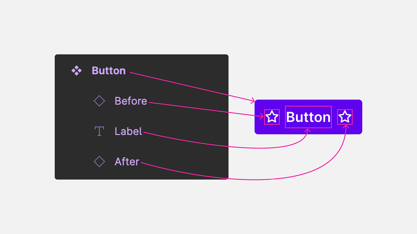
This Button component in Figma has three layers:
A component layer called “Before” – a component instance of a star icon.
A text layer called “Label” – the label of the
Button.A component layer called “After” – a component instance of a star icon.
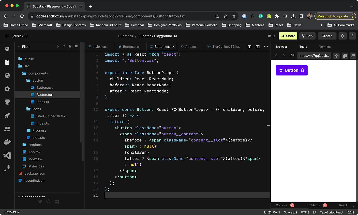
Now if we compare the Button layers inside of Figma to our TypeScript code which will generate the HTML DOM, we see some similarities and differences. Let’s first look at our Button code and then show the comparison.
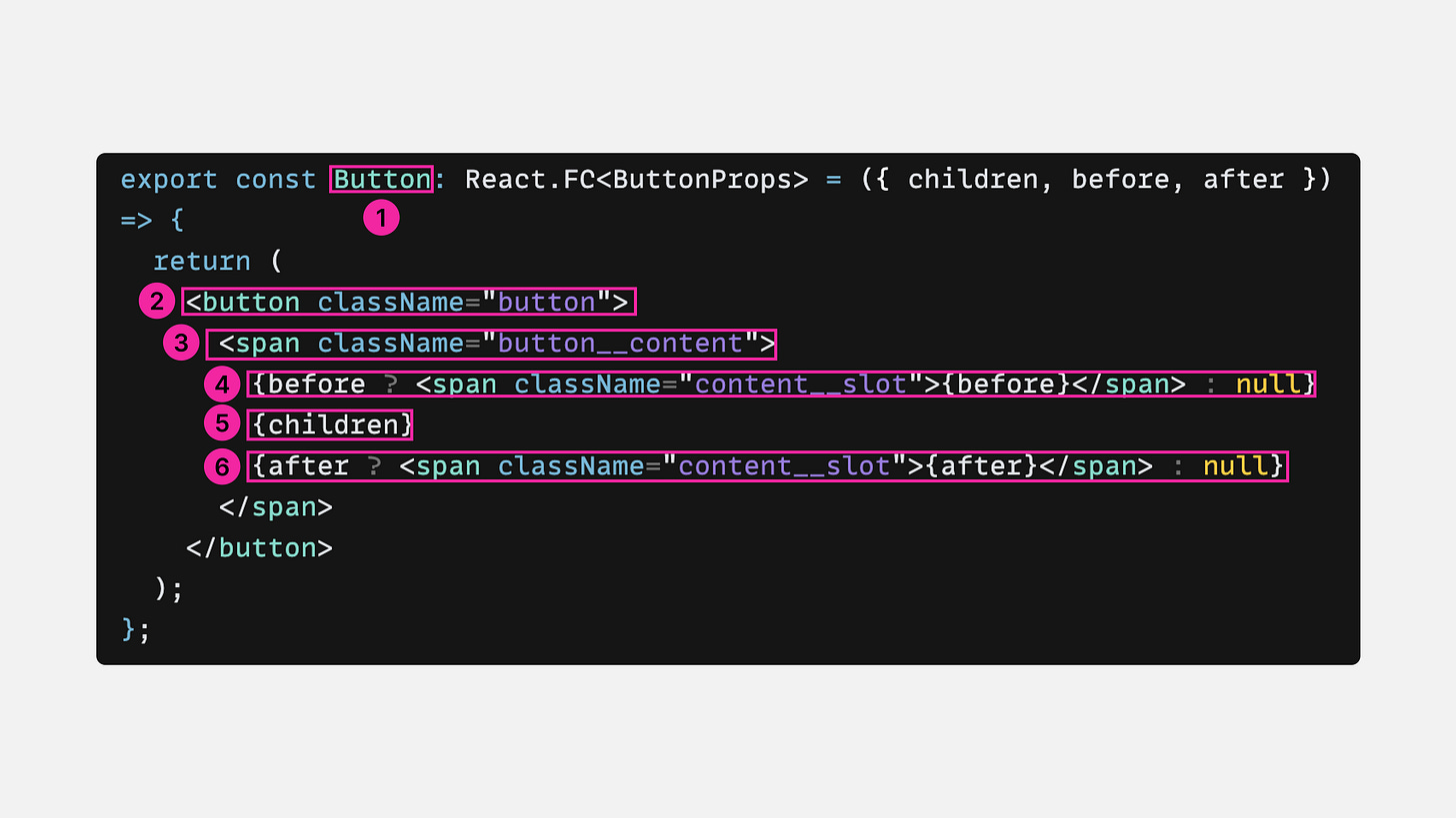
We have quite a bit going on, so let me break it down for you:
The first highlight we are declaring a constant component called “Button.”
The second highlight is a
<button>element.The third highlight is a
<span>element that contains the content of theButtonand applies flex (auto-layout) styles to its children: the icons and the label.The fourth highlight shows a conditional statement. Basically what I am saying is, “If the content is passed to the before slot, show it, otherwise don’t show anything (null).”
The fifth highlight shows
childrenwhich is a prop that allows content like a label to be defined by the consumer and wrapped in the component’s tags.The last highlight also shows a conditional statement, “If the content is passed to the after slot, show it, otherwise don’t show anything (null).”
By writing conditionals, we can dramatically reduce the component’s size with unwanted elements. Unfortunately, Figma does not conditionally render a layer when a boolean is true or false.
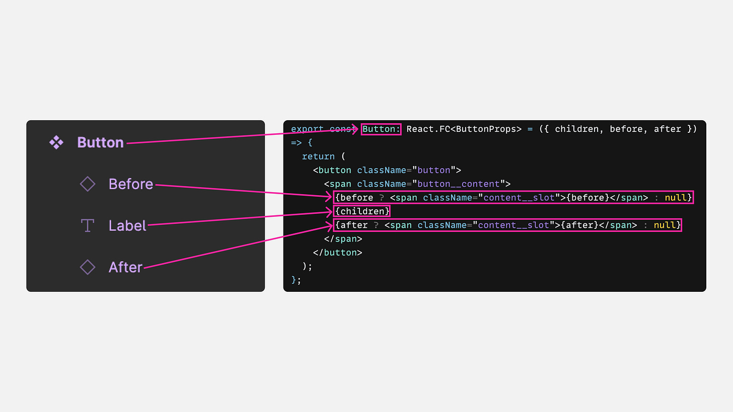
Above you can see how some of the Figma layers map to pieces of our code:
Button in Figma maps to the constant in code called “Button.”
The Before layer maps to the before slot.
The Label layer maps to the children slot.
The After layer maps to the after slot.
I used to be a lot stricter about my naming of layers in Figma, indexing heavily on BEM or other conventions to get as close to code as possible. But, at a certain point, you can go overboard and do a disservice to designers, potentially confusing them.
I recommend coming up with whatever convention works best for you and your teams while keeping some sort of parody with code.
Naming props
Similar to components, I believe that props should be familiar and easy to decipher. I personally think that prefixing prop names with “is” and “has” is redundant. When naming my props, here are some of the things I like to ask:
Is this semantic and self-explanatory?
Is this name consistent with my other components’ prop names?
Do I already have a pattern defined for this prop? For example, maybe I have a size prop with values of "xs”, “s”, “m”, and “l.” In this case, I would avoid spelling out the names like “small” and “large.”
Can I use an enum rather than multiple booleans to avoid the boolean trap?
Is this prop accessible? For example, I like to use before and after rather than left and right. This ensures support for both RTL and LTR languages. Before and after can be applicable in both cases.
While you can over-index on booleans, it is possible to do the same with enums. An approach that I dislike is creating an enum prop called variant and dumping values in there like “primary” and “secondary.” I feel it is important to abstract out color from variant and let variant handle the other styles. You can see my preferred approach in MUI’s Button component and the other case in Workbench’s Button component.
Figma’s properties and variants help to bridge the gap and get closer to code, however, they fall short. By separating out properties and variants as separate “things”, they miss the point and confuse designers. Additionally, the word “variant” is commonly used in props, and is not a separate feature of a component.
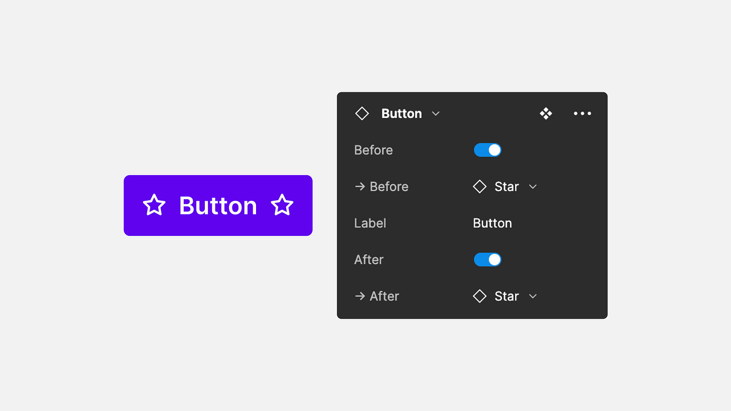
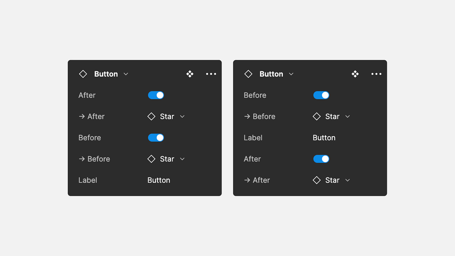
In Figma, you can set a boolean to hide/show a layer but you need to also link that layer to an “instance” prop. Additionally, the boolean prop is rather limiting, you can’t use conditionals and you can only show its connected layer when true versus showing when false.
When you are organizing your props, I suggest either alphabetically or based on how you think the consumer will configure your component. In the example on the right props are organized to configure the before slot, the label, and then the after slot.
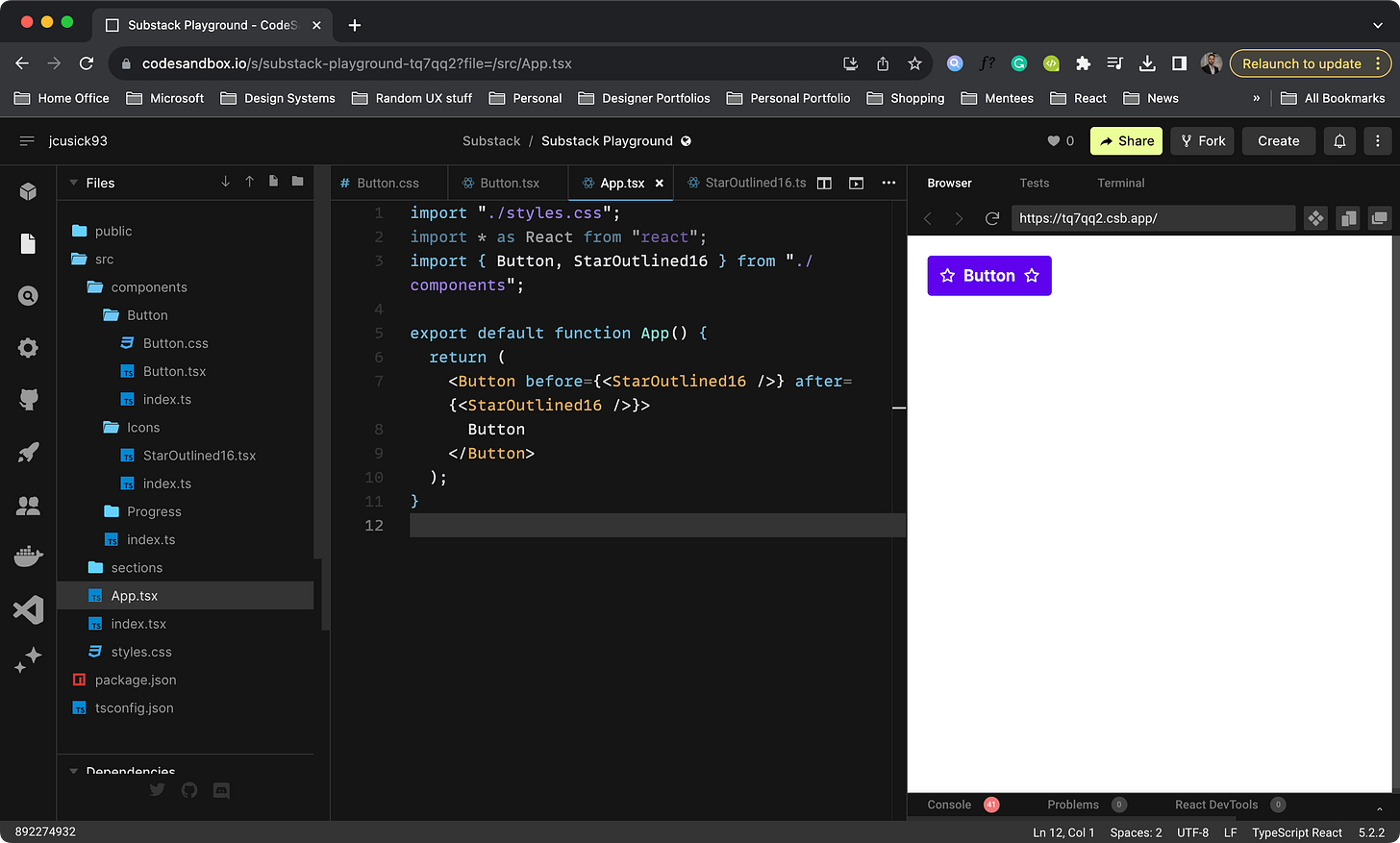
Revisiting our TypeScript code for our example Button we can get a more realistic idea of how booleans work.
In our code, we are using a ternary operator to check if any content is passed to the before or after props and conditionally render content if true.
Notice how we also have a children prop? This enables us to nest content inside the main slot of the Button component. While we could use the same approach as Figma by defining an explicit label prop to pass content to, the children approach is more common and developer-friendly.
Conclusion
There isn’t one size that fits all for naming things, and that is okay. My overall philosophy is to try to build a connection between design and code and develop a shared language. I don’t think that we will ever get to 100% parody and there is nothing wrong with that. But, if we can as designers and engineers come together and communicate our goals, I believe we can eliminate the headaches and deliver better experiences.
Thanks a ton for giving this article a read! If you found it helpful, do consider subscribing. And if you've got any thoughts or feedback, don't hesitate to drop me a message on Instagram.


