Exploring design tokens
A guide to streamlining design systems and enhancing scalability
Overview
Design tokens have become a pivotal concept in modern design and engineering, enabling teams to store style decisions in a semantic and scalable way. But before we dive in, let's first define what "design tokens" are.
According to Material Design, “Design tokens represent the small, repeated design decisions that make up a design system's visual style. Tokens replace static values, such as hex codes for color, with self-explanatory names.”1
The term "design token" was coined by Jina Anne at Salesforce nearly a decade ago.2 However, the idea of abstracting values with semantic terms has predated this for centuries. The concept of variables, fundamental to programming and mathematics, can be traced back to the 16th century. François Viète introduced the idea of representing known and unknown numbers by letters, allowing for computations as if they were numbers.3
In programming, a variable is defined as, “A named storage location that holds a value or data.”4
So in my view, the terms variable and design token are interchangeable.
Layers of abstraction
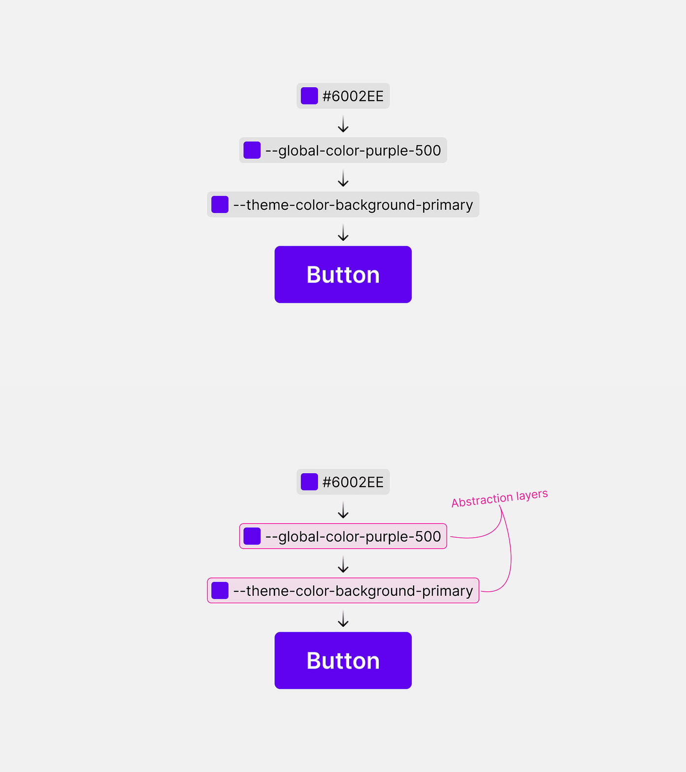
Abstraction layers allow multiple levels for design token sets, such as global and theme.
Design tokens are meant to be stacked, not standalone. In my experience, I typically see 2-3 abstractions on top of the raw value. The names of these abstractions vary but the concepts are largely the same.5
The advantage of multiple abstractions is fully realized at the implementation level. More specific tokens provide easier use than generic ones but are limited in coverage.
“An abstraction layer or abstraction level is a way of hiding the working details of a subsystem, allowing the separation of concerns to facilitate interoperability and platform independence.”
Global layer
The global layer largely serves as an official Rolodex of pre-approved variables. This set of tokens is more generic in name and typically enumerated in 10s or 100s. For example:
--global-color-purple-500: #6002ee;Let’s break down the name:
“Global” communicates the set that the token belongs to.
“Color” communicates the category of the token.
“Purple” communicates the palette of the token.
“100” communicates the level of the color on its ramp.
"Why not stop here?" you might wonder. "We could create a button and assign the background color using the token we've defined above."
.button{
background-color: var(--global-color-purple-500);
}
The problem with this approach is twofold:
The name of the token is not descriptive enough to ensure it is used properly in all cases. For a small team, this may work in the beginning, but as they scale it will become increasingly challenging to maintain consistency. A designer or developer that is new to the team will not intuitively understand that
--global-color-purple-500is used for interactive backgrounds.This will prove to be challenging for multiple themes. Sure, you can contextually switch the value of
--global-color-purple-500in light/dark themes, but this approach is awkward and unnatural as this would require you to modify the original purple ramp. I know that Radix does this, but to me, it just feels off.
Exceptions
There are some cases where global tokens can/should be consumed directly inside of components.
The litmus test I use to determine if the global token can be used is, “Does this style ever need to be themeable?” If the answer is no a global token will suffice.
An example of global token use is font size. Theming the font size can be tricky, as it can cause reflow and component scaling issues. We could create a global font size token:
--global-font-size-100: 1rem;And then we could build a Text component using global tokens, allowing the consumer to access those styles via props.
.text--font-size-100{
font-size: var(--global-font-size-100):
}
<Text fontSize={100}>Hello world!</Text>By creating an abstraction e.g. 100 → 1rem, we give ourselves the option to change that scale in the future, e.g. 100 → 1.125rem, and consuming teams would not see a breaking change. They would continue to use:
<Text fontSize={100}>Hello world!</Text>And the design system would handle the change for them.
Theme layer
The theme layer provides more context to the designer or engineer using the tokens. They should be descriptive enough to indicate their use, while also maintaining flexibility. My goal whenever creating token names is to empower the designers and engineers to be able to confidently select a token just by reading its name.
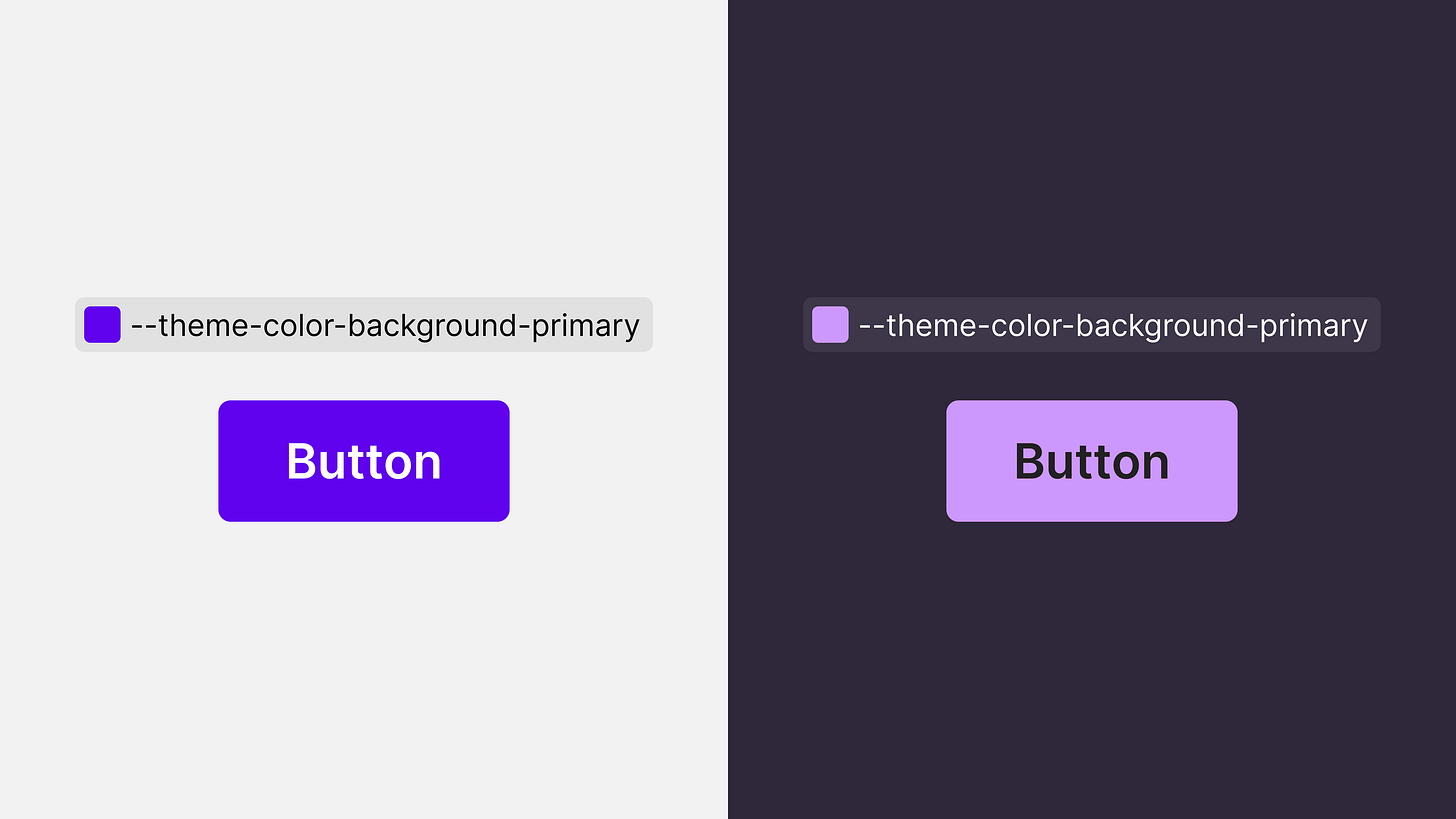
I’ve seen this layer implemented in several ways, but I will only cover two. In my research, I’ve found that the most efficient way to handle theming is to rely on opacity for states like Material Design does.6
Let's explore the differences between tokens that use opacity and those that do not:
Approach 1 (no opacity):
In this example, four colors are used for a button’s default, hover, and pressed states.
At the theme level, we would need to define four tokens, three for the backgrounds and one for the text:
/* backgrounds */
--theme-color-background-primary-default: var(--global-color-purple-500);
--theme-color-background-primary-hover: var(--global-color-purple-700);
--theme-color-background-primary-pressed: var(--global-color-purple-900);

/* text */
--theme-color-foreground-on-primary-default: var(--global-color-white-a100);
Let's pause and break down the name of the first token:
“Theme” communicates the set to which the token belongs.
“Color” communicates the category of the token.
“Background” communicates the subcategory, in the case of color I use background, foreground, and outline.
“Primary” communicates the intent.
“Default” communicates the state.
This approach is perfectly acceptable. The challenge however is when a design system wants to expand the button’s styles. For example, adding a more subtle variant with the primary color, such as a lighter tint button.
To resolve the above example, we would need even more tokens:
/* heavier background colors */
--theme-color-background-primary-default: var(--global-color-purple-500);
--theme-color-background-primary-hover: var(--global-color-purple-700);
--theme-color-background-primary-pressed: var(--global-color-purple-900);

/* lighter background colors */
--theme-color-background-primary-subtle-default: var(--global-color-purple-100);
--theme-color-background-primary-subtle-hover: var(--global-color-purple-200);
--theme-color-background-primary-subtle-pressed: var(--global-color-purple-300);

/* text colors */
--theme-color-foreground-on-primary-default: var(--global-color-white-a100);
--theme-color-foreground-primary-default: var(--global-color-purple-500);
So imagine trying to white-label your design system. Just for the primary color you now have six key-value pairs for a consumer of the design system to define. The more tokens you have, the harder it will be to manage.
Approach 2 (with opacity):
In this example, we are using three colors for all six cases. We can accomplish this by changing the opacity on the state layer.
The above example would require three design tokens:
/* background color */
--theme-color-background-primary: var(--global-color-purple-500);

/* text and state layer colors */
--theme-color-foreground-on-primary: var(--global-color-white-a100);
--theme-color-foreground-primary: var(--global-color-purple-500);
The naming convention is the same as the previous example, except for the state modifier at the end of the token’s name. By using a state layer we limit the number of tokens our design system has to maintain and new themes have to be defined.
Token domains
Design tokens can cover every imaginable design property and can quickly get out of hand. In my opinion, you don’t need a token for everything. A good place to start is color, border-radius, shadow, sizing (e.g. padding/margins), and font (e.g. font size and line height).
Color
Color is arguably the most used token in design systems and the most complicated. I found that breaking down color into three categories works quite well: background, foreground, and outline. Color tokens are state-agnostic, except for the disabled case.
Background
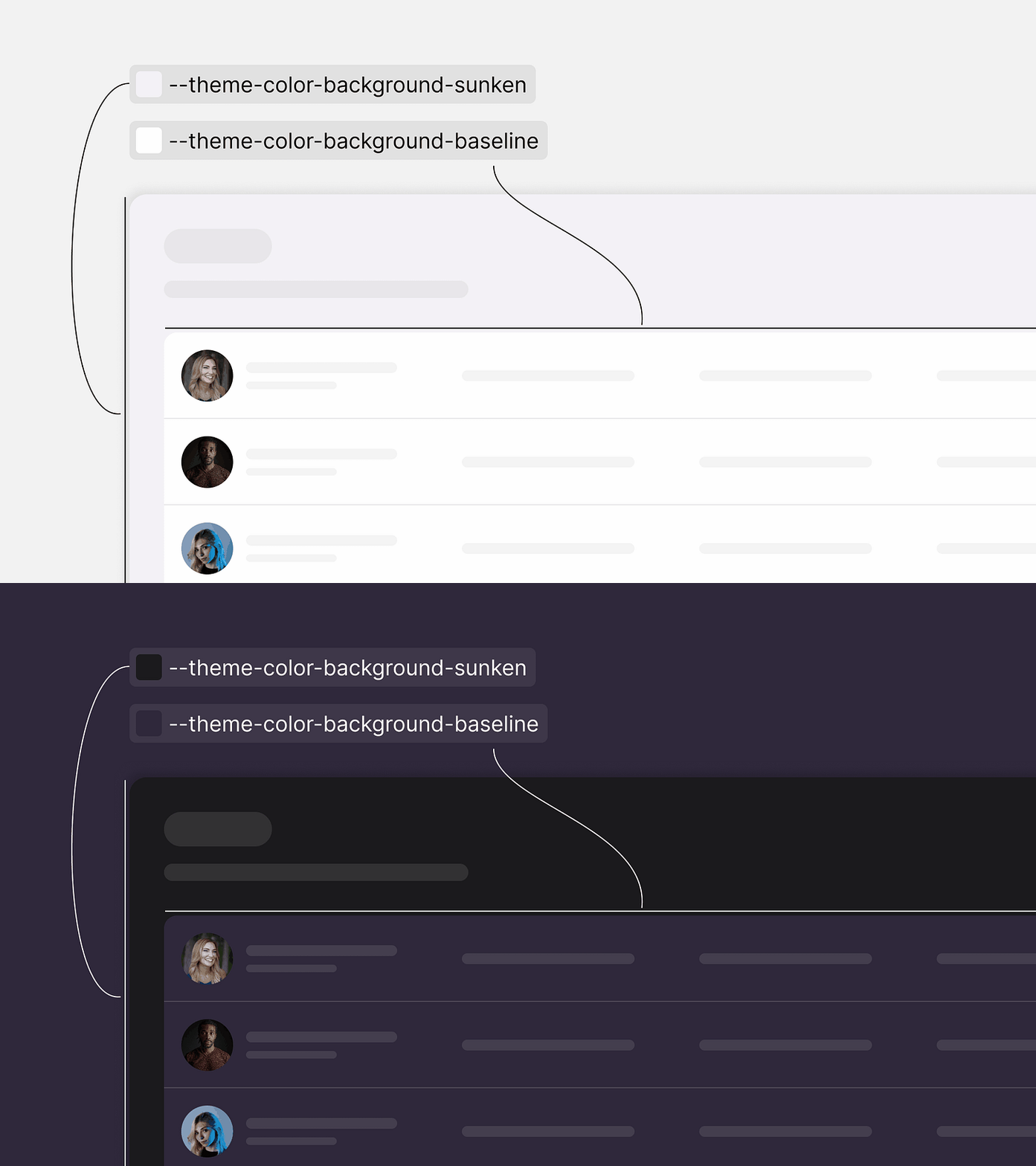
Each background color token is semantically linked to a specific surface. This practice is essential not only for maintaining consistent styles but also for ensuring a seamless dark-mode experience.
Primary: Interactive components with the brand color.
Negative: Components with a negative sentiment like an alert.
Positive: Components with a positive sentiment like a confirmation alert.
Warning: Components with a warning sentiment like an alert.
Info: Components with an informative sentiment like a promotional alert.
Disabled: Interactive components that are disabled.
Sunken: Components below the baseline. This term is borrowed from the Atlassian Design System.
Baseline: Components at the baseline of the app like a card.
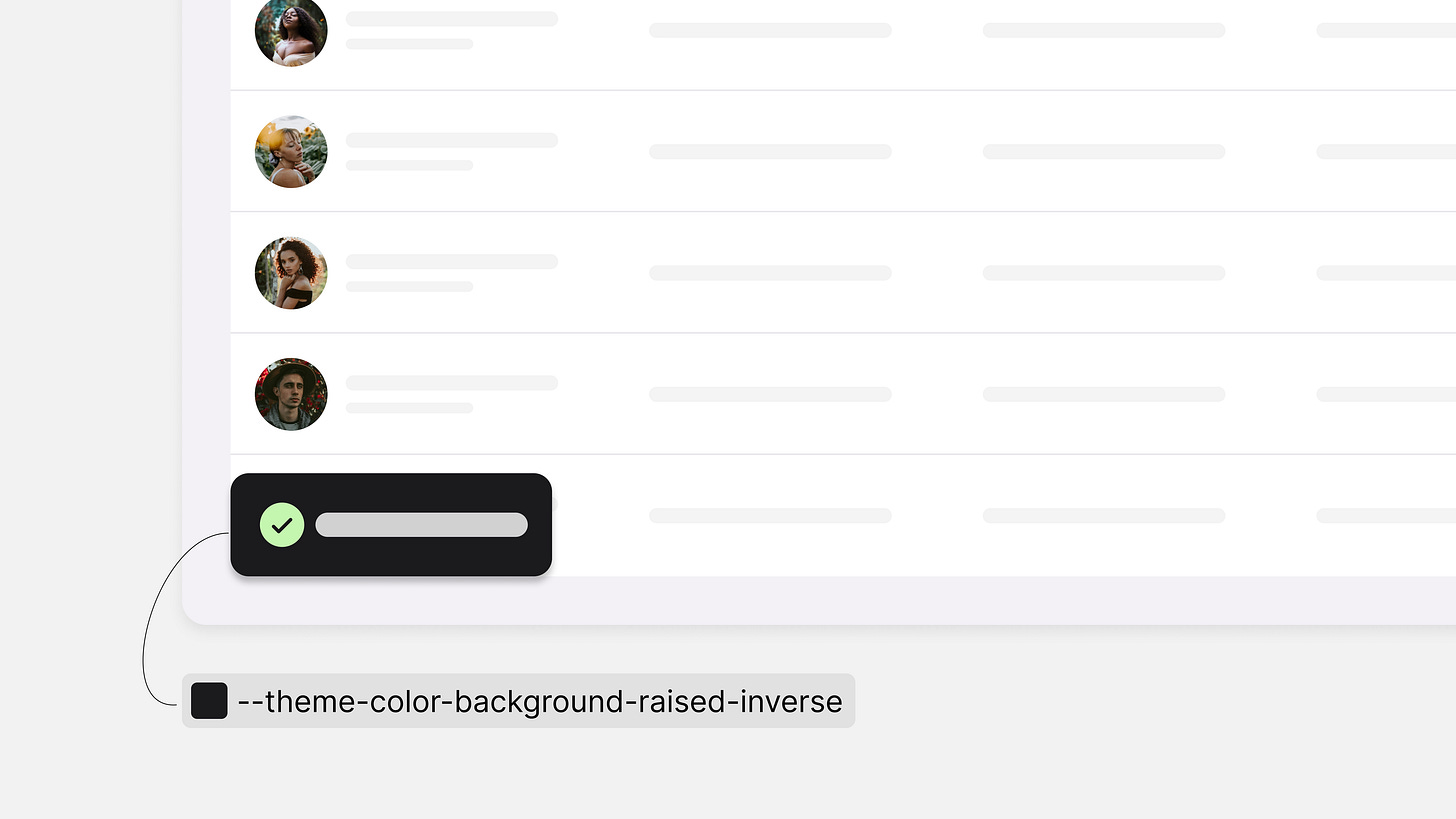
Raised: Components sitting just on top of the baseline like a toast or tooltip.
Overlay: Components at the highest z-index such as a modal.
What about inversions? There are cases where teams often like to invert the color to apply more contrast, such as a toast. This is why I like to provide an “inverse” for some of the colors.
Baseline inverse: Components at the baseline that need a higher contrast, such as a checked toggle.
Raised inverse: Components that sit above the baseline like a toast or tooltip.
Negative inverse: Components with a negative sentiment like a badge or delete button that need a higher contrast.
Positive inverse: Components with a positive statement like a badge that needs a higher contrast.
Info inverse: Components with an informative sentiment like a badge that needs a higher contrast.
Warning inverse: Components with a warning sentiment like a badge that needs a higher contrast.
Foreground
Foreground colors are used for any content that sits on top of a background such as text, icons, and state layers.
If paired correctly with the recommended background color token, foregrounds will always pass contrast requirements (barring the disabled case).
Primary: Interactive components with the brand color like a link.
Neutral high: A neutral color with a high level of contrast.
Neutral high inverse: An inversion to use on an inverted background.
Neutral medium: A neutral color with a medium level of contrast.
Neutral low: A neutral color with a low level of contrast.
Negative: Content with a negative sentiment like an error message.
Positive: Content with a positive sentiment like a success message.
Info: Content with an informative sentiment like a promotion.
Warning: Content with a warning sentiment like a warning inline alert.
Disabled: Text or icons that are disabled.
Need career advice or help with your design system? You can schedule 1:1 time with me via Superpeer.
Outline
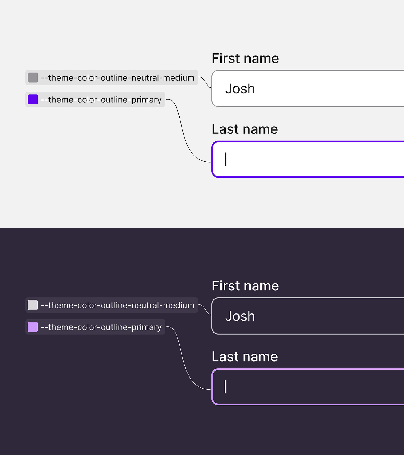
Outline colors are used for borders, dividers, and lines. In certain circumstances such as a focus ring, there are accessibility requirements.7
Primary: Interactive components like an outlined button or focus indicator of a text field.
Neutral high: High contrast outline.
Neutral high inverse: An inversion of the neutral high outline.
Neutral medium: Medium contrast outline.
Neutral low: Low contrast outline.
Negative: Components with a negative sentiment like an outlined destructive button.
Positive: Components with a positive sentiment like a success message.
Info: Components with an informative sentiment like an info message.
Warning: Components with a warning sentiment like a warning message.
Disabled: Disabled components like an outlined button.
Border-radius
To make things simple and easily digestible, I typically define 3-4 border-radius tokens at the theme level. Each of these tokens points to their respective global tokens. Their naming convention is similar to color.
--global-border-radius-100: 4px;
--global-border-radius-200: 8px;
--global-border-radius-300: 12px;
--global-border-radius-400: 20px;

...add more as needed

--theme-border-radius-x-small: var(--global-border-radius-100);
--theme-border-radius-small: var(--global-border-radius-200);
--theme-border-radius-medium: var(--global-border-radius-300);
--theme-border-radius-large: var(--global-border-radius-400);X-small: Small components like a badge or small button.
Small: Small components like a button.
Medium: Medium components like a card.
Large: Large components like a table.
Shadow
Shadow tokens are composite tokens.8 This means they are made up of multiple variables. To define a shadow you need five properties:
Offset-x
Offset-y
Blur
Spread
Color
The shorthand in CSS for box-shadow looks like this:
box-shadow: 0px 4px 4px 0px rgba(0,0,0,.25)I separate the first four properties at the global level. For example:
--global-shadow-100-down-x: 0px;
--global-shadow-100-down-y: 2px;
--global-shadow-100-down-blur: 6px;
--global-shadow-100-down-spread: 0px;
Let’s break down these names.:
“Global” communicates the set to which the token belongs.
“Shadow” is the category.
“100” is the level of the shadow.
“Down” is the direction of the shadow.
“X” is the property of the shadow.
Now on the theme layer in light and dark modes is where we can define the rest of the shadows:
--theme-shadow-low-down: var(--global-shadow-100-down-x) var(--global-shadow-100-down-y) var(--global-shadow-100-down-blur) var(--global-shadow-100-down-spread) var(--global-color-black-a20);This would translate into:
--theme-shadow-low-down: 0px 2px 6px 0px rgba(0,0,0,.2);It’s worth noting that you could create a common tokens object for shared theme tokens like border-radius and spread that into each theme. The Token Studio Figma plugin is my go-to tool for tokens and has this feature.
const commonVars = {
...
}

const lightTheme = {
...commonVars,
// other vars
}

const darkTheme = {
...commonVars,
// other vars
}
Space
Space can be a tricky one to theme, depending on your system, and how much customization you want to allow will determine if you need theme tokens. I don’t allow for that as it can cause reflow issues with the components and break UIs.
Typically I suggest space tokens for common style properties like margin, padding, and gap.
--global-space-100: 2px;
--global-space-200: 4px;
--global-space-300: 8px;
--global-space-400: 12px;

/* more tokens here */
Space tokens are pretty straightforward, just pick a scale that works for you.
Font
Font tokens are another tricky one, the only property I allow for theming is the font family. There are many properties that you can provide tokens for, but I recommend the basics first.
Font family
Font size
Line height
Font weight
There are a few ways I have seen font tokens play out.
--global-font-family-inter: "Inter", sans-serif;
--global-font-size-100: 1rem;
--global-line-height-100: "120%";
--global-line-height-200: "150%";
--global-font-weight-400: 400;
The percentage as a variable works quite well, however, if you are trying to stick within a grid e.g. 4px, this will not always work. For example, if for a heading you use 2rem (32px) then 120% of that would return 2.4rem (38.4px).
The other option would be to define a token paring for every single font size. As you might imagine this would result in a lot of tokens.
The option that Nick Saunders and I most recently explored was to calculate the line height inside the Text component.
So once the user defined the font size we would multiply that number by 1.5 and then round to the nearest 0.25rem.
<Text fontSize={100}>Hello world!</Text>The code above would return 1rem (16px) for the font size and 1.5rem (24px) for the line height.
The user would be able to configure the line height as well, selecting between the two options.
<Text as="h1" fontSize={300} lineHeight={100}>Hello world!</Text>The code above would return an h1 with a font size of 3rem (48px) and the line height would be calculated by multiplying 3rem by 1.2 → returning 3.6rem then rounding up to the nearest 0.25rem, giving us a final value of 3.75rem (60px).
Adding a token at the theme layer is a nice touch as it will allow you to add more font families for other cases, like “expressive” or “productive” fonts”.9
--theme-font-family-productive: var(--global-font-family-inter);
--theme-font-family-expressive: var(--global-font-family-josefin-sans);
Automating your workflow
The best CI/CD token workflow I have discovered is a combination of Tokens Studio, GitHub Actions, and Style Dictionary.
This workflow allows the design system designer(s) to define tokens inside of Figma, and push changes into their repo with the plugin. GitHub Actions can run your SD build when a designer creates a PR with the plugin.
Overall a really cool and efficient workflow, saving engineers and designers time and resulting in more efficiency. The plugin also allows you to fetch the tokens from the repo, meaning if a token was removed by an engineer, that change would sync to Figma.
Tying it all together
Tokens (or variables) are a powerful tool to supercharge your design system and make teams extremely efficient. When design decisions are well-documented and abstracted into variables, both designers and engineers can confidently style their components within the parameters of the design system. This allows them to spend less time guessing what colors or styles to use and leverage that time to make better designs and move swifter.
So if you are a stakeholder or executive funding a design system and don’t think you need to spend time on design tokens, think again. Upfront the cost may seem expensive, but I can guarantee that it will provide you and your teams massive efficiency boosts, positively impacting your bottom line.
Thank you for reading this article. I have much more to share about design tokens and my lessons learned, but expanding it further would make the article ten times longer. If you have any questions or want to chat further about design systems, message me on LinkedIn.







Thank for sharing this 💖
I have question how to manage the design tokens to make sure that there's no duplication