

Design system primitives
How to supercharge your design system and empower adopters with basic building blocks hooked into your design tokens

Hey everyone 👋, this week I dive into design system primitive components. They are extremely beneficial to help adopters of your system rapidly iterate experiences using design tokens. Excited to chat about this topic and would love to hear what you all think of it.
So leave me a comment below!

I recently wrote about how design systems should do less and offered an alternative model for governing them. TLDR: Design systems should focus on core components, patterns, and design tokens. They should be careful which things get “componentized” and cycled into the system.
But if the design system only offers core components like buttons, checkboxes, and text fields, how can we empower consuming teams to actually use the system?
How do they extend the system to build local components?
Enter primitives.

A primitive is a supercharged element like a div with top-level props to access tokens. Common primitive names are “Box” and “Stack”.
Atlassian states, “Primitives are powered by design tokens and make it easier to apply design decisions. This reduces cognitive overhead, improves productivity, and prevents accidents or mistakes.”1
Currently, there is no elegant way to build primitive components inside Figma. The closest analogy I can provide is a frame using variables.
Types of primitives
There are many types of primitives, but the ones I find most common and valuable are Box, Stack, and Grid. I’m confident that if they are built flexible enough, they will cover most use cases.
Box
A Box is a div or polymorphic component that has easy access to the design system’s tokens. Imagine a div that has been “dipped” in the design language.

A polymorphic component is a single adaptable component that can represent different semantic HTML elements, with TypeScript automatically adjusting to these changes.
Depending on your goals, you can do whatever you want with the Box API. Personally, I think you should offer everything that the HTML element does plus top-level props that hook into tokens.

Let’s take a look at an example:
import * as React from "react";
import { tokens } from "@acme/design-system";

// The interface for Box with polymorphic "as" prop
interface BoxProps<T extends React.ElementType> {
  // 🧙 Optional 'as' prop to render different elements
  as?: T;
  children?: React.ReactNode;
  // Top-level prop for background color
  backgroundColor?: "sunken" | "baseline" | "raised" | "overlay" | /* other tokens */;
  // 🚪 Styling backdoor
  style?: React.CSSProperties;

}

// Define a helper type to infer props of the "as" element
type PolymorphicProps<T extends React.ElementType> = BoxProps<T> &
  Omit<React.ComponentPropsWithoutRef<T>, keyof BoxProps<T>>;

export const Box = <T extends React.ElementType = "div">({
  as,
  children,
  backgroundColor = "baseline", // Default to "baseline"
  style,
  ...rest
}: PolymorphicProps<T>) => {
  // Set the default element to 'div' if 'as' is not provided
  const Component: React.ElementType = as || "div";

  // Dynamically access the background color token using the backgroundColor prop
  const backgroundColorToken = tokens[`themeColorBackground${backgroundColor.charAt(0).toUpperCase() + backgroundColor.slice(1)}`];

  return (
    <Component
      style={{
        // Apply the dynamic background color
        backgroundColor: backgroundColorToken,
        ...style

      }}
      {...rest} // Spread other props like className, id, etc.
    >
      {children}
    </Component>
  );
};
In the above example, I provided a top-level prop for backgroundColor with names that tie into tokens.
For example, if I were to set backgroundColor: “sunken” → then the tokens.ThemeColorBackgroundSunken variable would be applied to the Box’s background.
Obviously, you would need to form an opinion on what top-level props to offer. I think that the Box API should offer only top-level props that are token-related, e.g. color, boxShadow, borderRadius, etc.
Notice how I also provide a backdoor as well for style? The design system should allow for teams to decide how they want to consume a component and allow for mixing and matching.
See the below example:
// Approach #1 ✅
<Box style={{backgroundColor: tokens.themeColorBackgroundSunken}} />


// Approach #2 ✅
<Box backgroundColor="sunken" />
The design system should not be in the business of controlling everything. It should give teams the tools they need to build how they see fit.
Boxes in design systems
Stack
A Stack is similar to a box, but primarily used for layouts. If you’re anything like me, you use display:“flex” frequently. I recently dabbled in React Native and was delighted to see that they offer a View component that uses display:“flex” by default. Additionally, SwiftUI has HStack and VStack components that serve the same purpose.

But if we were to make Stack a polymorphic component like Box, why do we even need it?
I think it comes down to ease of use and fewer keystrokes. I find when rapidly iterating it helps me to have top-level flexbox-specific props.
Let’s take a look at what a Stack might look like:
import * as React from "react";
import { tokens } from "@acme/design-system";

// The interface for Stack with polymorphic "as" prop
interface StackProps<T extends React.ElementType> {
  // 🧙 Optional 'as' prop to render different elements
  as?: T;
  children?: React.ReactNode;
  display?: "flex" | "inline-flex";
  gap?: 100 | 200 | 300 | 400 | /* add more tokens as needed */;
  flexDirection?: React.CSSProperties["flexDirection"];
  justifyContent?: React.CSSProperties["justifyContent"];
  alignItems?: React.CSSProperties["alignItems"];
  // 🚪 Styling backdoor
  style?: React.CSSProperties;
  // Add more props as needed

}

// Define a helper type to infer props of the "as" element
type PolymorphicProps<T extends React.ElementType> = StackProps<T> &
  Omit<React.ComponentPropsWithoutRef<T>, keyof StackProps<T>>;

export const Stack = <T extends React.ElementType = "div">({
  as,
  children,
  gap = 100,
  flexDirection,
  justifyContent,
  alignItems,
  display="flex",
  style,
  ...rest
}: PolymorphicProps<T>) => {
  // Set the default element to 'div' if 'as' is not provided
  const Component: React.ElementType = as || "div";

  // Define the gap token based on the gap prop & dynamically access the gap token like tokens.globalSpace100, tokens.globalSpace200, etc.
  const gapToken = tokens[`globalSpace${gap}` as keyof typeof tokens];

  return (
    <Component
      style={{
        display,
        // Apply the gap token
        gap: gapToken,
        flexDirection,
        justifyContent,
        alignItems,
        ...style
      }}
      {...rest} // Spread other props like className, id, etc.
    >
      {children}
    </Component>
  );
};
For my non-technical readers, I want you to pay attention to this little bit here:
gap?: 100 | 200 | 300 | 400 | /* add more tokens as needed */;
flexDirection?: React.CSSProperties["flexDirection"];
justifyContent?: React.CSSProperties["justifyContent"];
alignItems?: React.CSSProperties["alignItems"];
What I am doing is giving users a way to compose a Stack super quick like this:
<Stack gap={200} flexDirection="column">...</Stack>vs
<div style={{display: "flex", flexDirection="column", gap: tokens.globalSpace200 }}>...</div>In Figma, the same would be done by applying auto-layout to a frame with a gap using the 200 variable:

Stacks in design systems
Grid
The Grid is a polymorphic component that manages the app’s entire layout. It can be a very important primitive for a design system. Having one helps to ensure a consistent layout across screens and even applications.

Your Grid component can reflect how strict or flexible your design system is and I think that it should definitely use design tokens. Regardless of how you build your Grid, it is important to have responsiveness baked in:
// s is 4 columns, m is 6 columns, and l is 12 columns
<Grid>
// spans 2 cols or 50% in s, 3 cols or 50% in m, and 6 cols or 50% in l
 <GridItem span={{s: 2, m: 3, l: 6}}>...</GridItem>
 <GridItem span={{s: 2, m: 3, l: 6}}>...</GridItem>
</Grid>
I also think that Grid should control the breakpoints, gap, and column count and then pass props in to allow for some customization within the pre-defined styles.
Grids in design systems
Practical applications
Let’s look at an example:
A team wants to create content that goes inside of a card component. The Card is largely unopinionated and lets users put whatever they need to in it.
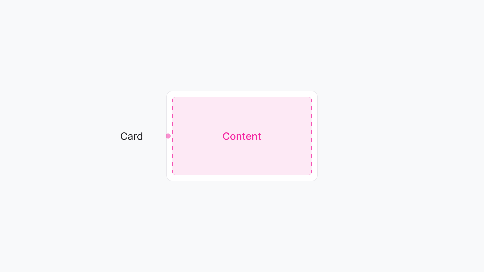
<Card>
// anything can go here
</Card>
The Card manages the following CSS properties, some linked to tokens, others not:
background-color: ✅ Linked to a token
padding: ✅ Linked to a token
display: 🚫 Not linked to a token
border-radius: ✅ Linked to a token
border-width: ✅ Linked to a token
border-color: ✅ Linked to a token
border-style: 🚫 Not linked to a token
padding: ✅ Linked to a token
This team wants to stack two pieces of text on top of each other and manage the gap between the two items. So to do this, they could nest a Stack inside the Card:

This is a pretty simple pattern, so alternatively the team could use a div and just apply inline styles to it:
// Approach #1: No Stack
<Card>
 <div style={{display: "flex", flexDirection: "column", gap: tokens.globalSpace100}}>
  <Text as="h3" color="neutral-high" size={200}>Jane Smith</Text>
  <Text as="span" color="neutral-medium" size={100}>Sr. Product Designer</Text>
 </div>
</Card>
The above approach is not “wrong” but incurs limitations and is not type-safe. The engineer would have to know what tokens to apply and how to apply them. They are also required to enter more keystrokes. For a simple layout, this approach works ok, but a more complicated pattern would result in many more keystrokes.
Now let’s look at an alternative approach with a primitive:
// Approach #2: With Stack
<Card>
 <Stack flexDirection="column" gap={100}>
  <Text as="h3" color="neutral-high" size={200}>Jane Smith</Text>
  <Text as="span" color="neutral-medium" size={100}>Sr. Product Designer</Text>
 </Stack>
</Card>
Let’s break this down:
The top-level component is the
Card.Inside the
Card, we have theStack. It sets the direction of the content to column (vertical) and applies thetokens.globalSpace100variable to the gap property by defininggap={100}.Inside the
Stackwe have two polymorphicTextcomponents:The first is an
h3using the tokens.themeColorForegroundNeutralHigh and tokens.globalFontSize200 variables.The second is a
spanusing the tokens.themeColorForegroundNeutralMedium and tokens.globalFontSize100 variables.
Building the content inside of the Card with primitives is a much smoother and type-safe alternative to inline styles. The engineers and designers can be confident they are styling content within the parameters of the system and that their content will render correctly in light and dark modes.
Tying it all together
Embracing primitives like Box, Stack, and Grid within your design system not only enhances its flexibility but also empowers teams to build with confidence and creativity. By providing supercharged elements that connect directly to design tokens, we can drastically reduce cognitive load and streamline the development process. These primitives allow teams to maintain design consistency while still offering the freedom to innovate.
Let me know what you think by leaving a comment! And if you enjoyed this post please hit that ♥️ like button.
https://atlassian.design/components/primitives/overview
This is good from the perspective of empowering teams with freedom of problem solving, but I fundamentally disagree it contributes to cohesive user experiences. The value of design systems is not only in accelerating the product design and development process but to ensure users don’t have to learn new Ui patterns or ways to achieve a goal at every module / view / page they encounter. Today’s products are highly fragmented due to this product trio bottom up empowerment which doesn’t account for what happen before of after in the user journey.
I think the elements you suggest are valuable but introduce issues in the end user experience (the most important thing) if not paired with review processes and cross team alignment… then why not encoding that alignment in standardised UX?
Thanks 😊