

Flexible typography in React
How to make your typography dangerously efficient, scalable, and accessible

Hey everyone 👋, this week I am diving into how to achieve flexible typography inside of your design system or product, resulting in better engineering and design experiences. If done correctly, this enables teams to rapidly test and deploy typography variants within the parameters of your design language. Enjoy and let me know what you think in the comments below!

The backbone
I recently wrote about design system primitive components. TLDR: A primitive is a supercharged element like a div with top-level props to access tokens. Common primitive names are “Box” and “Stack”.
In that article, I touched on typography, but I think it deserves more than a cameo.
Often, design systems teams overlook typography, and it becomes an afterthought or nice-to-have. Just create styles and move on, right?
Wrong.
Typography is the backbone of a design system and product. It must be consistent, scalable, and accessible.
The unique thing about typography is that to make up a single style, multiple properties must be defined:
.heading-large-semi-bold {
 font-family: "Inter", sans-serif;
 font-weight: 600;
 line-height: 120%;
 font-size: 2rem;
 color: #222222;
}
The infinite style approach, where a new style is created every time a team needs a new variation, tends to overwhelm the design system and consuming teams. The more styles are created, the harder it is to maintain them.

Before moving into solutions, the design system must have a strong POV on typography and composition. In my experience, there are two schools of thought:
The design system is all-knowing and all-powerful. Teams have the luxury of using their components and must do as they are told! Therefore, typography should never be overridden or customized.
The design system is a product and a service designed to empower teams to make thoughtful decisions and move quickly. Therefore, other than some key styles like font-family, compositions are encouraged, and teams are empowered to unblock themselves.
If we chose option 1, this article would be over, but luckily for you, I recommend option 2.

Design systems teams bog themselves down by trying to control everything, then they get frustrated when teams don’t “do as they are told.” I learned the hard way that option 1 is never the answer.
Design tokens
Design tokens or variables equip us to build powerful and themable typography components that adhere to the system’s design language. I wrote about design tokens in-depth in another article, and I’m assuming you read it, so I won’t repeat myself.
Let’s take another look at that initial class with tokens:
.heading-large-semi-bold {
 font-family: var(--theme-font-family-productive);
 font-size: var(--global-font-size-1000);
 font-weight: var(--global-font-weight-600);
 line-height: var(--global-line-height-120);
 color: var(--theme-color-foreground-neutral-high);
 }
In the above example, we now have a heading class that uses design tokens, meaning it is in the parameters of the design language, and it will work in any theme, but we’d have to create a new class for every style.
What if a team has an edge case for changing a property, like the font-weight or the color?
In either case, we’d have to amend the first class to include more properties and create new classes:
.heading-large-semi-bold-neutral-high {...}
.heading-large-semi-bold-[some color name] {...}
.heading-large-bold-neutral-high {...}
Just looking at that crap stresses me out. What if there was a way for the design system team to have strong opinions and create a backdoor for teams to tweak the styles as needed?
To do so, we’d need to define the negotiable and non-negotiable properties. In my opinion, here’s what is negotiable and non-negotiable:
✅ color: negotiable (must use preselected tokens)
✅ direction: negotiable
✅ font-family: negotiable only on the theme layer
✅ font-size: negotiable (must use preselected tokens)
🚫 font-variant: non-negotiable
✅ font-weight: negotiable (must use preselected tokens)
🚫 letter-spacing: non-negotiable
✅ line-height: negotiable (must use preselected tokens)
✅ text-align: negotiable
🚫 text-decoration: non-negotiable
🚫 text-transform: non-negotiable
✅ white-space: negotiable
🚫 word-spacing: non-negotiable
You might spot a trend above, I think that most properties should be customizable, only if tokens are used.
Variants
Typography components should offer the best of both worlds: give teams variants and let them customize.
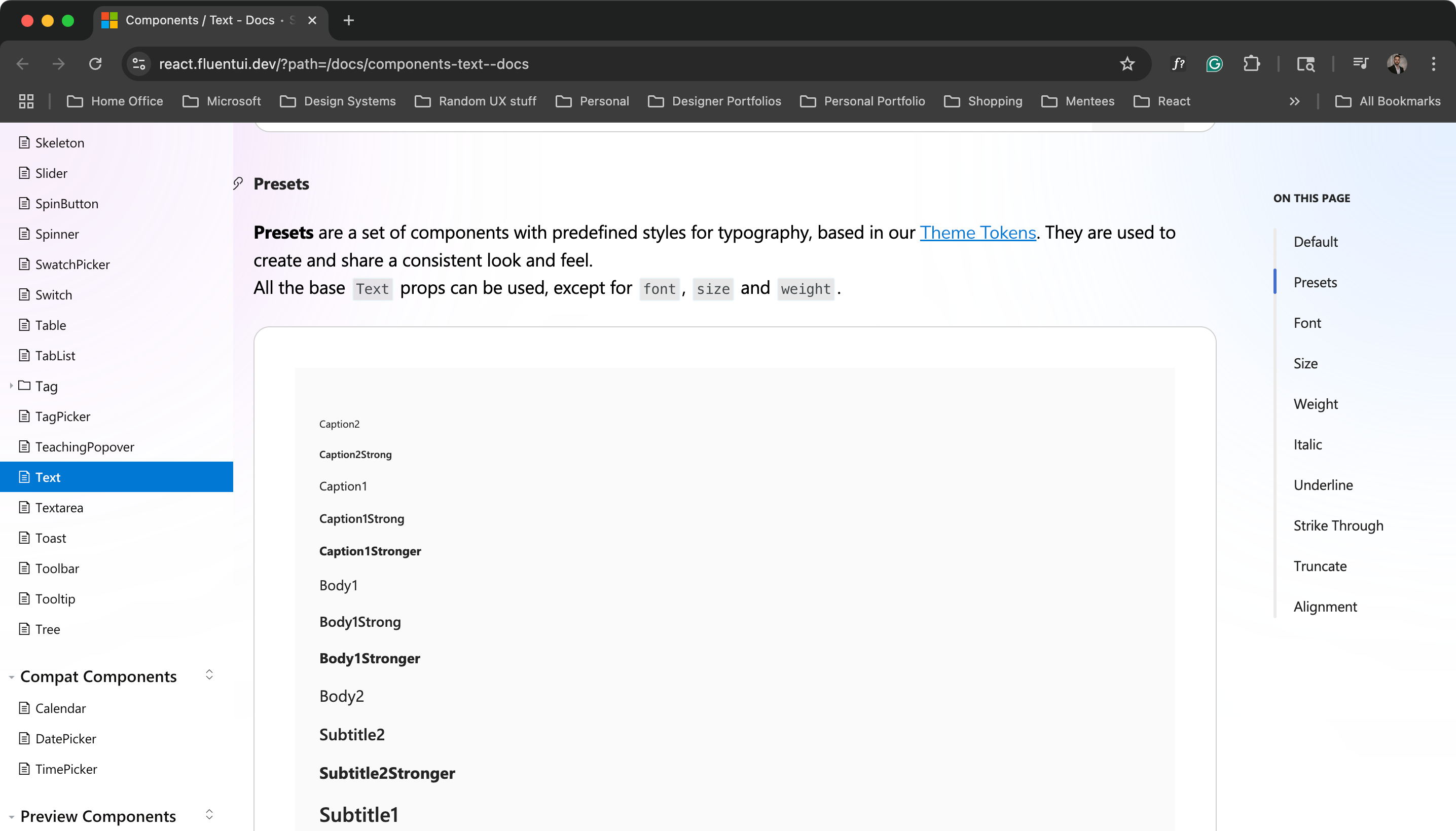
I think Fluent does a pretty good job of offering both, although they offer preset subcomponents rather than just a single Text one.
Less is more; start with the most basic variants and add as needed later. For my example, all body variants get the same weight and line-height as will the heading variants. Remember, we can solve for the 80% use cases and allow for customizations.
Let’s identify a few:
“body-small”: Small lines of text, such as a caption
“body-medium”: Default font-size for all body copy
“heading-small”: Small headings, such as an eyebrow
“heading-medium”: Medium headings like a card title
“heading-large”: Large headings are mainly used for page titles
Notice how I don’t add the heading level? This is because variants should mostly be agnostic of the element type. The exception is that if it is a body variant, it should NOT be a heading element. If it is a heading variant, it should be one of the 6 h elements e.g. h1.
There will be cases where a “heading-large” might need to be an h2 or a “heading-small” might need to be an h1. The design system should have general guidance on this, but consumers should be able to configure it as needed.
Let’s start to build this in React + TypeScript:
import * as React from "react";
import tokens from "@design-system/tokens";

interface TextProps {
  variant?: "body-small" | "body-medium" | "heading-small" | "heading-medium" | "heading-large";
  children: React.ReactNode;
...more props
}

// function to dynamically get the text styles
const getTextStyles = (variant: TextProps["variant"] = "body-medium"): React.CSSProperties => {
  // Map variant to fontSize from tokens
  const fontSizeMap: Record<NonNullable<TextProps["variant"]>, string> = {
    "body-small": tokens.globalFontSize100,
    "body-medium": tokens.globalFontSize200,
    "heading-small": tokens.globalFontSize800,
    "heading-medium": tokens.globalFontSize900,
    "heading-large": tokens.globalFontSize1000,
};

  // Map variant to lineHeight from tokens
  const lineHeightMap: Record<NonNullable<TextProps["variant"]>, string> = {
    "body-small": tokens.globalLineHeight150,
    "body-medium": tokens.globalLineHeight150,
    "heading-small": tokens.globalLineHeight120,
    "heading-medium": tokens.globalLineHeight120,
    "heading-large": tokens.globalLineHeight120,
  };

  // Map variant to fontWeight from tokens
  const fontWeightMap: Record<NonNullable<TextProps["variant"]>, string> = {
    "body-small": tokens.globalFontWeight400,
    "body-medium": tokens.globalFontWeight400,
    "heading-small": tokens.globalFontWeight600,
    "heading-medium": tokens.globalFontWeight600,
    "heading-large": tokens.globalFontWeight600,
  };

  return {
    fontFamily: tokens.themeFontFamilyProductive,
    fontSize: fontSizeMap[variant],
    lineHeight: lineHeightMap[variant],
    fontWeight: fontWeightMap[variant],
    color: tokens.themeColorForegroundNeutralHigh,
  };
};

export const Text: React.FC<TextProps> = ({ variant = "body-medium", children }) => {
  return <span style={getTextStyles(variant)}>{children}</span>;
};
Ok, so what does this mean? We just created a “smart” text component that dynamically assigns token values to its properties based on the value passed to the “variant” prop.
In practice, we would be able to use this Text component like this:
<Text variant="body-small">Hello world!</Text>And this would dynamically return the following styles (we are using CSS-in-JS not CSS modules, so bear with me):
.body-small {
 font-family: var(--theme-font-family-productive);
 font-size: var(--global-font-size-100);
 font-weight: var(--global-font-weight-400);
 line-height: var(--global-line-height-150);
 color: var(--theme-color-foreground-neutral-high);
}
Pretty solid start, but we’re still missing some important capabilities:
Lacks polymorphism: The component always renders a
span, but we should support rendering as different elements e.g.p,h1,div, etc.Static color: The text color is hardcoded with a single token, limiting flexibility.
Limited customization: Aside from the
variant, we can’t easily override styles likefont-weight,font-size, orline-height.No responsiveness: The component doesn't adapt to different screen sizes or support responsive typography.
Polymorphic components
Imagine a world where you could change the element type and spread those attributes automatically with a single prop definition. Well…you can.
A polymorphic component is a single adaptable component that can represent different semantic HTML elements, with TypeScript automatically adjusting to these changes.
Polymorphic components offer flexibility by allowing consumers to configure them as needed. Making the Text component polymorphic empowers engineers while trusting them to use it responsibly.
Ok, let’s go back to my previous example and rework it as a polymorphic component and add in some more flexibility:
import * as React from "react";
import { tokens } from "./tokens";

// Define allowed text style variants for consistent typography usage
type TextVariant =
  | "body-small"
  | "body-medium"
  | "heading-small"
  | "heading-medium"
  | "heading-large";

// Define possible numeric values for font sizes
type TextSize = 100 | 200 | 300 | 400 | 500 | 600 | 700 | 800 | 900 | 1000;

// Define allowed line height values (percentages)
type TextLineHeight = 120 | 150;

// Define allowed font weight values (numeric)
type TextWeight = 400 | 500 | 600 | 700;

// Define allowed semantic text colors mapped to design tokens
type TextColor =
  | "primary"
  | "neutral-high"
  | "neutral-medium"
  | "neutral-low"
  | "negative"
  | "positive"
  | "warning"
  | "info"
  | "disabled";

// Map TextColor keys to corresponding token keys in the design tokens object
const colorTokenMap = {
  "neutral-high": "themeColorForegroundNeutralHigh",
  primary: "themeColorForegroundPrimary",
  "neutral-medium": "themeColorForegroundNeutralMedium",
  "neutral-low": "themeColorForegroundNeutralLow",
  negative: "themeColorForegroundNegative",
  positive: "themeColorForegroundPositive",
  warning: "themeColorForegroundWarning",
  info: "themeColorForegroundInfo",
  disabled: "themeColorForegroundDisabled",
} as const;

// Define the props accepted by the Text component, with generic 'as' for polymorphism
interface TextOwnProps<T extends React.ElementType = "span"> {
  as?: T; // Allows overriding the underlying element type (e.g. "p", "h1", etc.)
  children: React.ReactNode; // Text or elements nested inside the Text component
  variant?: TextVariant; // Semantic text style variant (body, heading, etc.)
  color?: TextColor; // Semantic color for the text
  size?: TextSize; // Optional override for font size
  lineHeight?: TextLineHeight; // Optional override for line height
  weight?: TextWeight; // Optional override for font weight
  style?: React.CSSProperties; // Inline styles for custom CSS overrides
}

// Compose props to include native props of the element type while omitting any conflicting keys
type PolymorphicTextProps<T extends React.ElementType> = TextOwnProps<T> &
  Omit<React.ComponentPropsWithoutRef<T>, keyof TextOwnProps<T>>;

// Define the default style attributes for each variant
const variantMap: Record<
  TextVariant,
  { size: TextSize; lineHeight: TextLineHeight; weight: TextWeight }
> = {
  "body-small": { size: 100, lineHeight: 150, weight: 400 },
  "body-medium": { size: 200, lineHeight: 150, weight: 400 },
  "heading-small": { size: 800, lineHeight: 120, weight: 600 },
  "heading-medium": { size: 900, lineHeight: 120, weight: 600 },
  "heading-large": { size: 1000, lineHeight: 120, weight: 600 },
};

// Text component supporting polymorphic 'as' prop for different HTML elements
export const Text = <T extends React.ElementType = "span">({
  as,
  children,
  variant,
  color = "neutral-high", // Default color if none provided
  size,
  lineHeight,
  weight,
  style,
  ...rest
}: PolymorphicTextProps<T>) => {
  // Determine which HTML element or component to render, default is "span"
  const Component = as || ("span" as React.ElementType);

  // Get default variant styles or fallback to "body-small"
  const resolvedVariant = variant
    ? variantMap[variant]
    : variantMap["body-small"];

  // Use explicit props if provided, else fallback to variant defaults
  const computedSize = size ?? resolvedVariant.size;
  const computedLineHeight = lineHeight ?? resolvedVariant.lineHeight;
  const computedWeight = weight ?? resolvedVariant.weight;

  // Map color semantic key to the actual color token value
  const colorTokenKey = colorTokenMap[color];
  const colorToken = tokens[colorTokenKey];

  return (
    <Component
      style={{
        fontFamily: tokens.themeFontFamilyProductive, // Use the design system's font family
        fontSize: tokens[`globalFontSize${computedSize}`], // Font size from tokens
        lineHeight: tokens[`globalLineHeight${computedLineHeight}`], // Line height from tokens
        fontWeight: tokens[`globalFontWeight${computedWeight}`], // Font weight from tokens
        color: colorToken, // Text color from tokens
        ...style, // Allow overriding styles via prop
      }}
      {...rest} // Pass any additional native props to the rendered component
    >
      {children}
    </Component>
  );
};
Let me explain what is happening here.
We’re building a flexible Text component that lets you pick which HTML tag it renders using the as prop. So, you can do something like as="p" or as="h2" and still get all the right styles applied. This way, engineers can keep their HTML semantic without losing a consistent design.
On top of that, we’ve got semantic variants like "body-small" or "heading-large". These variants map to a standard set of font sizes, line heights, and weights, so if you use one, you get a nicely styled text element with zero extra effort.
If you want more control, no problem, you can override size, lineHeight, weight, and even style directly. That’s great for when you need something custom (hopefully with tokens 🤞).
Colors work the same way. Instead of juggling exact token names, you just pass semantic names like "positive" or "warning", and the component maps those to real theme colors behind the scenes. Keeps things clean and easy to read.
Plus, since we accept all the usual native props (id, className, etc.), the Text component fits right in with whatever you’re building and stays fully consistent with the design system.
Dynamic line-height
While working with Nick Saunders at Albertsons, we came up with the idea to dynamically calculate line-height based on the font size. The alternative would have been to create a separate line-height token for every corresponding font-size token or rely solely on percentages, which could risk breaking alignment with the 4px grid.
// Get the numeric font size in rems from tokens, e.g. 0.875
const rawSize = tokens[`globalFontSize${computedSize}`];

// Get the unitless line height multiplier from tokens, e.g. 1.2
const rawLineHeight = tokens[`globalLineHeight${computedLineHeight}`];

// Multiply to get the raw line height in rems
const lineHeightRem = rawSize * rawLineHeight;

// Round up to the nearest 0.25rem (equal to 4px)
const dynamicLineHeight = `${Math.ceil(lineHeightRem / 0.25) * 0.25}rem`;

// Usage
lineHeight: dynamicLineHeight,
How the rounding works:
First, we calculate the exact line height by multiplying the font size (
rawSize) by the line-height multiplier (rawLineHeight). This gives a value inremunits.To keep consistent vertical spacing aligned to a 4px grid, we round this value up to the nearest multiple of 0.25rem, since
0.25remequals 4 pixels (assuming the root font size is 16px).We do this by:
Dividing the raw line height by
0.25to find how many 0.25rem "chunks" fit into the value.Using Math.ceil() to round up to the next whole number of chunks, ensuring we never undershoot the grid.
Multiplying back by
0.25to convert the rounded chunk count back into rem units.
This ensures the line height always fits neatly into the 4px grid and improves the overall look of your typography.
Responsiveness
One example I’m aware of that handles responsiveness for typography components is MUI. They require you to define scaling styles at the theme level or use their responsiveFontSizes() helper function to automatically adjust font sizes across breakpoints.

Personally, I prefer managing responsiveness directly inside the component. The idea is to define breakpoints and then provide style overrides based on the current breakpoint.
For example:
const responsiveOverrides = {
  'body-small': {
    small: { size: 100 },
    medium: { size: 200 },
    large: { size: 300 },
  },
  // other variants...
};
Another option that I am a fan of is the useBreakpoint() hook in the Workbench Design System. This would abstract the responsive behavior out of the component and create a reusable hook to use in other components.
For example:
import * as React from "react";
import { useBreakpoint } from "@acme/design-system";

const App = () => {
  const isMedium = useBreakpoint('m');
  const isLarge = useBreakpoint('l');

  return (
    <Text as="h1" size={isLarge ? 500 : isMedium ? 400 : 300}>
      Responsive Heading
    </Text>
  );
};
There is no “correct” approach with responsiveness; most systems don’t even bake it in, which I think is a shame. Having that capability, even if it’s just with a hook, is powerful.
Tying it together
Flexible typography doesn’t mean letting go of structure. It means building with intention and giving teams room to breathe. A strong base of tokens, smart defaults, and clear guardrails helps everyone move faster without breaking consistency. Start simple, scale responsibly, and remember your typography system should work with your teams, not against them.
Let me know how you’re tackling this in your system. I’d love to hear what’s working or not.
Curious about your variable naming for font-weights. Would "--global-font-weight-400" ever be anything other than 400? If yes, would that be confusing?
Lately I've been testing using semantic variable names like "--font-weight-emphasis" so that I have the option of changing the underlying weight from, say, 500 to 600. This has been helpful in early design phases when a font changes and I want to re-map the weights.